“The final end of Eternity, and the beginning of Infinity” ― Isaac Asimov, The End of Eternity
Introduction
Since our inception in October 2021, RadRugs has grown from an idea, to having a team of dedicated and talented reviewers, community managers, designers, developers. Plus an incredibly strong and engaged Community/DAO working towards the same goal: “make a positive impact in people’s lives”. Now that our application has officially launched, our roadmap is also steadily progressing.
To better reflect our vision and growth of our project, we decided to undergo a complete rebrand. We are now very excited to share the result of our efforts!
Process
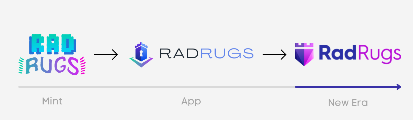
At the beginning of the project, our goal was to establish a strong brand image that would inspire confidence and security. Our original logo was inspired by the pixelated art in our collection, with Solana’s colors.
Once our collection was launched and the community was well established, we finalized the development of the first version of our application. There we decided to use a different logo than the NFT collection, in order to differentiate between the NFTs and the app.
Now our vision is well established and we have created a legal entity – we have a clear objective: to make RadRugs a reference in the crypto community under a single brand image. This is how the rebranding initiative was born.
Concept
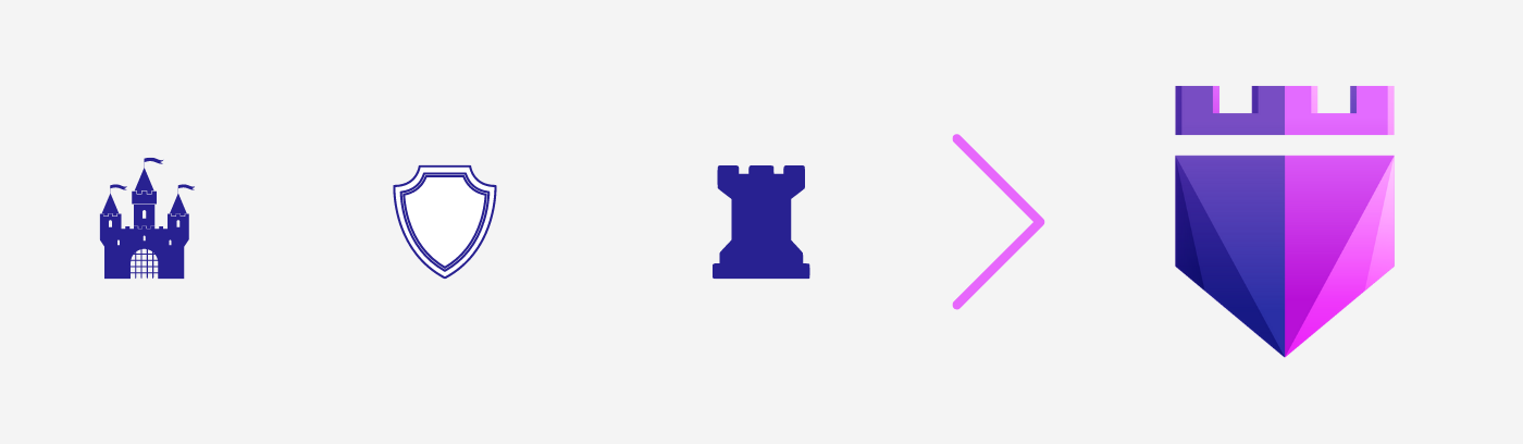
A castle, a shield, a tower…we want RadRugs to represent thoughts of “Safe Haven”.
The image of the castle has quickly imposed itself within the team. The castle evokes protection, safety from a potential enemy, and provides a refuge for those who live within its walls.
In addition, the shield evokes the same idea of protection, but on a more personal, individual level. This notion of protecting yourself by using the tools at your disposal fits perfectly with our vision of “doing your own research”.
Finally, the rook is an important piece of the chess game. Investing in NFTs can often be likened to a game of chess, where moves are studied, planned, and then executed according to a well-defined plan.
These elements fueled the design of the new brand image.
Brand Guidelines
Logo
Rather than starting from scratch, we wanted to use the version of the logo currently in use for our application. Through an iterative process within the team, we wanted to create a professional, simple and inspiring logo that would be compatible with different media sizes and shapes.
The logo uses simple elements that everyone can easily understand and that inspire trust. A sense of depth was implemented into the logo, using angles and color variations.
The font used highlights the word “Rad” — we want to encourage people to stand out and be positive agents of change in the community.
Color Palette
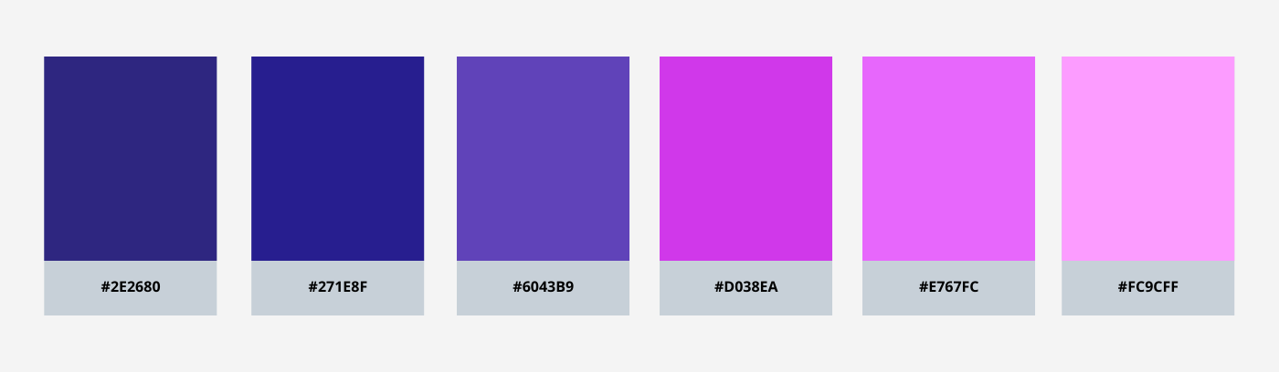
The colors used are largely inspired by the Solana universe. These colors are dynamic, lively and encourage action.
Conclusion
Brand design is an important element in expressing the vision of the project and creating a strong connection with users. This initiative is an important step for RadRugs as we position ourselves as the industry leaders in researching and evaluating NFTs projects, while providing our users and the entire community with a quality experience across all channels, including vision, utility, and brand.
As the Asimov quote at the beginning of this article indicates, the evolutionary journey of RadRugs is the beginning of a never-ending story. The best is yet to come!
Community 👋
If you have any questions or comments, feel free to contact us:
- Website: https://radrugs.io/
- Project Reviews: https://app.radrugs.io/
- Discord: https://discord.gg/radrugs
- Twitter: https://twitter.com/RadRugsNFT
- Email: [email protected]